Test Hard, but Test Smart—a New Message to the Designers Part 4

Formulating Smart Testing Groups

Welcome on this final part of the series. As we have explored the factors involved in the testing a website and what to test in previous part, we will finally go to the browser group formation so we can know how to test smartly within limits of time and devices.

Options for Testing

We have some good options for testing in industry such as emulators, virtual machines working on servers or cloud, and some awesome testing services like Open Device Lab, BrowserStack, etc. are helping us different ways for different purposes. It is true that emulators and other above described options are good to cover wide range of devices for instance, if your target audiences are on the Android devices in majority and you have to test some where 2000 devices or hundreds of representative devices and their browsers, you are okay with them without spending much on devices possessions.

Issues with Optional Testing

At other hand, affordability and user experiences are issues with such services. If you want to know that what is loading time, how your UI elements fitting into your deserved parameters, and which hardware is conflicting in which device are tough to obtain in such remote or virtual testing. Therefore, we have to group our devices smartly by balancing our testing requirements, resources, and time devoted for manual or automated testing. In short, you have to decide the priorities for your browsers, devices, and their parameters or properties.

Ways To Do Smart Grouping

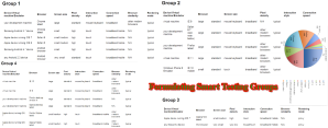
Formulating First Group

Let’s decide, which devices with, which browsers we must have for our first group, which can cover at least 50% of your targeted audience population.

  • Development Machine/desktop/laptop
  • Two Apple devices: one with latest iOS (iOS8) and another with a previous version (iOS7)
  • There Android devices: one with latest Android OS (4*) and Chrome, second with one-step backward version of Android OS (<4) and other Android browsers, and final one with older version of Android OS (2*) and with small screen size. Here I prefer 3 devices for Android platform because Android devices cheaper to buy and we need to cover more representative devices in order to cover huge audiences of Android.

Thus, now we have browsers of three screen size groups: first for big devices like desktop with Windows and Mac operating system, second groups have medium screen size with Apple and Android devices with latest versions, the third group would have small screen with backward version of OS and browsers.

In our first group we are covering browser types as Chrome, Safari, and some Android specific browsers.

Fortunately, at Lujayn our responsive web designing team is capable to cover vast audience with this group of devices and browsers in their rigorous testing of the websites of our patrons and successfully debug the most of the issues before any complain has made.

Formulating Second Group

Now our second group will include virtual machines for different kinds of browsers because in first group we have covered only Chrome and Safari. Therefore, now we are adding IE and Firefox in this second group using virtual machines against the costly devices. Thus, we will cover IE 8 and IE 11 on virtual machines for large screens and IE 10 for the emulator of Windows Phone as small screen size.

Moreover, our development machines will cover Safari and Firefox browsers for large screen tests. Thus, this second group has only one Window Phone emulator with touch experiences, otherwise rest have pointing devices experiences.

Formulating Third Group

For third group, you need to have only one Apple device with Opera Mini browser and one Nokia Ovi devices with Ovi browser.

Formulating Fourth Group

Whereas in fourth group you can add BlackBerry devices, BrowserStack testing services, virtual machines, and you development machines for wide range of browsers that you missing in above three groups.

This way you will cover almost 100% of your audiences with least investments on devices, services, and time.


Test Hard, but Test Smart—a New Message to the Designers Part 3

Testing Parameters for Websites

In previous part 2, we have seen that the deep understanding of audiences, devices, and their use-cases can make big difference in decision of testing strategies and methods. Now, in this one more part, we will see that ‘what to test’, and how to formulate browser groups, in order to do smart testing of your mobile websites.


Test Matrix

If we have enough knowledge of testing parameters and we know, which parameters are needed for which products, we can do smart testing with least efforts and greater accuracy. Therefore, it is mandatory to know and decide the testing matrix first.


Screen size: we are aware of fragmentation in the screen sizes of the mobile devices, thus, testing our fluid or responsive layouts, UIs, and various dynamic elements on our major targeted devices in real world make big sense.


Screen Resolutions: Pixel density or screen resolutions is among the parameters to test for the clarity and ease in use of mobile app. However, there are tough time when you have to calculate pixel and sub-pixel values for different browsers of mobile devices during layout preparation of your websites.


Connectivity: user experiences are highly depends on the connectivity issues and speed of connection as loading time increase may distract users of your responsive or mobile website. This the reason that mobile devices are not capable to do high-speed data transfers and use of high-speed cloud or web services at optimal levels as desktops can do. Thus, you need to test connectivity and related issues first and debug them to improve performance.


Interactivity: interactivity depends on many factors in designing and coding. However, styles of interactions like use of pointing devices like mouse and touch gestures through fingers and thumb are important for better user experiences during normal use cases of the mobile website or web app. Some devices have hardware buttons while iOS like have software or operating system elements to do frequent interactions so test them thoroughly in user experience testing.


Similarity among Browsers: it has seen that many browsers have almost similar properties and supports while some have acute differences. Therefore, if we segregate such browsers in groups of similarities and differences, we can save our valuable time from repeated testing, as we can leave rest of similar browsers by selecting only one browsers from the group and focusing on browsers of dissimilar groups more.


Rendering Mode of Browser: As we know modern browsers have two kinds of rendering modes, one is standard client-side rendering and another is proxy rendering. Technically, client-side rendering browsers use resources of client devices, while proxy-rendering browsers use server-side resources to render a page.


Thus, proxy-rendering browsers are quick to respond and fast to load in compare to standard client-side rendering browsers. Therefore, you have to check the kinds of browsers and test them accordingly in their different modes.


If you have pure intentions to make smart testing during your web development or PSD to Joomla development projects, you need to apply all fundamentals described in this series.


Test Hard, but Test Smart—a New Message to the Designers Part 2


Mobile Audience
Mobile Audience

In the first part of this series, I have described my thoughts on testing and my smart strategies for testing responsive web designs.


As we know that the nature and purposes of every website is unique and differing from others even among the same niche and competitors. Therefore, it natural that the audience of the website also unique so we have to consider the traits of website and its audience at first place while deciding the testing strategies.


Properties of Your Audiences

It is true that people from effluent class use mobile devices in more incidences, as that is the latest trend in the market and they always like to keep ahead themselves using costly devices. Against this, young generation wish to see themselves as tech-savvy and modern people so they prefer mobile devices while less affluent class of people have no luxury of desktop/laptop devices along with mobiles. Thus, they choose to stay with low or medium cost mobile devices and use them frequently.


These reveal a hard-fact that we are going to deal with web audiences with desktop devices in minority and mobile users going to be in increasing majority.


Form Factors of Devices

We know that iPhone is more popular in US and Canada as well as some in UK and Australia, while rest of world is fan of cheaper Android devices. Moreover, China and India have their own choices in forms of devices and their smartphones are just like mini tablets or called ‘Phablets’ in industry because they want to type large fonts of their local language characters in their messages.


Against these, cheaper mobile sets from Nokia like companies are popular in rural India where long battery life is a big issue. After looking such variations, we have to decide the choices of devices in the regions of our targeted audiences and test them accordingly.


Time Factor

Use of devices hence the usage of browsers are varying with the time and mood of the people. For instance, it has observed that during working days people are present in their work spaces where they have big sister devices like desktops at hand so their usage found high while on holidays or Sundays it decrease dramatically.


Therefore, we don’t prepare our testing strategies according to the time of engagement of people with devices and browsers, our chances of failure and unexpected errors increasing many folds. Thus, we have to be smart enough to go for testing.


Conclusively, based on these observations and experiences, we web development team at Lujayn are deciding our testing strategies and selection of browser groups


I hope, in next part of this series we will check what to test and how to formulate browser groups to do smart testing.


Author Bio:

Shoaib Marfatiya is an eminent writer in web development industry and its verticals. He has contributed a lot by throwing lights on very intricate issues of web and mobile development community.

Test Hard, but Test Smart—A New Message to the Designers Part 1

Test Hard, but Test SmartIt is hard fact that we are living in multi-screens and multi-devices era of the web and mobile applications. Unlike earlier desktop only designing, we have to design UIs for cross-platforms and cross-browsers. Designing itself is not tough as we know how to go responsive well now. The real issues arise when we are going to test our website or mobile application for a release.

Today, I shall restrict up to website designing and testing leaving mobile application for next time so my target is responsive web design. Few years back, we have to consider testing our website on five to six browsers on the desktops including Windows and Mac PCs. Unfortunately, today we have to test on nearly 15 browsers and numbers of mobile devices including tablets along with smartphones of various sizes.

Testing Tough & Costly

Therefore, testing is not only time-consuming, but also costly affairs for small start-ups or even seasoned freelancers. Hardware fragmentation is at its peak and we have numbers of mobile devices to test the responsive website. It is true that we can’t cover entire our audience with profound testing as possessing numerous devices is a nightmare even a big web development company.

Think of Smart Testing

In short, you have to forget the complete testing on all the devices your target audience is using. Instead, if you have a solid testing strategy, you can cover majority of population of your targeted audience. In other words, you should be smart enough in testing and cover sizable audience with least investment of time and most importantly money on purchasing real testing devices.

If you closely observe the properties of browsers and testing devices, you will find best clues to get some smart ways to do things quickly and cheaply. For instance, if you code is running smoothly on the Chrome of Samsung devices, then probabilities are higher that they will have less friction on other browsers of Android devices. If your IE 9 has error free screen then least chances remain for IE 11 to show JavaScript errors.

Based on such similarities and peculiarities of browsers as well as devices, we can group them in a logical manners and can give them priorities according to our website and our targeted audiences. Unfortunately, each website is unique and have unique audience as no business is same in the market, we have to carve browser groups each time for each new project. Based on my experiences, I can say that it is not much difficult to get mastery over time.

As per my strategy, I sometime test only 50% browsers and release the website. Afterwards, I test rest of browsers and fix the long tails without delaying my release data further. Another strategy is I never leave brand new version of website that is releasing first time without testing on all of my browser groups, say four groups.

Of course, I do test only primary and secondary browser groups when I am a bit in hurry and website is for redesigning. However, accomplish rest of browsers in one or more steps at later dates. This way I apply the rules of ‘smoke testing’ by fragmenting my testing schedule. However, smoke testing offers you only some flexibility and relaxations, but never let you escape from complete testing on your all browser groups.

I especially, apply smoke testing on the PSD to Joomla conversion projects where we have to deal with mainly B2B clients and they are in hurry to produce results of their end clients. I hope we will discuss on testing and creating browser groups in next part as we have space constraints in this post.


Web Development Works A Bit Differently Today

Web Development Project Management

Due to proliferation of mobile devices, internet is ubiquitous and web accessibility is very easy. People use smartphones to do everything including shopping. Therefore, businesses are sincere to have their web presence as well as mobile app in app store.

Unfortunately, latest surveys reveal altogether different things and say that only 50% small businesses in US have web presence. If you think they are busy, not true. They already know the magic of m-commerce and wish to jump into the bandwagon. What is real problem then?

They live in a myth where web development is tough to understand and some failure stories of others intimidate them to go for a website development process. In the past, web developers were discussing about the reference sites with the owners of the small businesses.


In the Past

They were focusing on the pleasing the top management or owners of the businesses, by incorporating color, design, content, etc. of the choice of the business owners. In return, businesses were not thinking about the success and contributing factors in the success. They just were taking proud of having a web presence.


Businesses Take Interests in Web Development Process

Now, scenario has changed. Businesses are discussing the strategies behind the website. They are eager to know their target audience, behavior of target audience, motivation, likeness, and dis-likeness of the targeted audience through initial research carried by the web development experts.

Now, they are ready to cooperate outsourcing companies to know their businesses and their strategies by providing supplementary information to the marketing and technical teams of the offshore web development company that, they have selected.


Businesses Take Active Role in Web Development

In the past, web development process was left on the lower hierarchy post professionals in the small businesses or big businesses. Now, top management is taking personal interests and allocate responsible and capable managers to take active part in the project management software used by the modern web development companies. They would like to interact directly with developers and designers.

Web designers producing wireframes and prototypes of high fidelity using latest designing software on the desktop and smartphones to show their live, dynamic, and interactive wireframes as well as prototypes to their tech-savvy clients instead of mere PSD or JPG or PNG files from the web designers. The live and timely feedback of the businesses making web development a bit differently than they were in the past.


Businesses Aware of Time Frame and Budget

Active interest and live interactions remain up to the completion of the website development or web application development project. Businesses are eager to know the testing results in their regular updates in PMS or through instant messengers. They are upfront asking the time line and budgets of their web development project and keep close eyes on the development process.

Many small businesses are smart enough and taking hire web developers packages as advantages and save a lot of money and time for their project. Therefore, I have put title of page as modern web development works a bit differently and create true collaborations as well as maintain partnership like relationships with web development companies in favor of both sides.