Category Archives: Web Development

Businesses Have Misconceptions about Web Development

It has observed that when businesses decided to have their own web presence and even in responsive web designing, they are running with some common misunderstanding regarding the web development process and web development team. These misconceptions or myths may sour their relationships with web development team or company itself.

Therefore, I have decided to give some insights based on our experiences as a web development team at Lujayn serving wide range of clienteles across the globe.

Myth #1 – These Are Simple Changes

Being a well-experienced web development company, team at Lujayn is preparing project scope documents where we are defining things in advance that what should be included, and what should exclude in the set price structure. Despite such preventions for project creeps, some businesses come up with small changes that they think as minor ones and can address with little efforts and time.

However, that is not true at technical point of view because simple looking websites may have intricate functionality and complex interactions in backend. Thus, always their programming becomes time-consuming and expensive at logic even a simple change in location of a button may take days to accomplish in coding and testing.

Solutions:

Businesses should define their requirements upfront and always discuss with team prior to suggest any changes as well as offer extra cost if your changes require the substantial amount of time and efforts from your hired web development team.

Myth #2 – Templates Are Okay

It is true that market is flooding with ready to use templates or themes and some software available to build a website using GUI tools without doing any coding at all, just drop and drag work flow. Of course, templates are good for those who need low-end and temporary web identity at initial stage and ready to customize them when their time and money come on hand.

Solutions:

In majority of cases, businesses, be they small or big want to augment their brands and have thirst for good ranking in SERP for their business keywords. Therefore, it is imperative for them to come up with unique and SEO friendly websites for their users and bots in order to get the best ROI.

Myth #3 – Web Development One Time Process

Majority of businesses think that once website has built their work is over. However, they are not true because web development is not one time process even though you have created customized web identity with the latest responsive web designing technologies, as web development team needs to update it regularly as well as check or test it frequently for its compatibility and user experiences in contemporary sense.

Web and mobile technologies are ever-changing field and your current websites may become obsolete after two or three years and you need to redesign it with the latest coming technologies at that time.

Solutions:

Therefore, my best advice for business houses to keep good relation with your web development company and take their help regularly by paying on their maintenance packages or for support or update charges.

Myth #4 – Anyone Can Do UX

When businesses have to select the web development company as their IT partners, they used to check presence and capabilities of graphics designers for UI and programmers for interactions and dynamism, but never ask for UX experts. Designing mere UIs and programming them can’t bring good user experiences on your websites because expertise and experiences in UX is quite advance and different discipline in software development as well as in any industrial product development.

Solutions:

Thus, check whether your hired web development team has UX experts included or not and ask for the portfolio of UX professionals too.

Current Common Practices in Web Typography Part 1

Summary:

It is true that web typography is a bit different from print and constantly evolving due to ever-changing nature of web itself. At present, we are experiencing new opportunities on presentation front due to emerging mobile era as well as facing intricacies in implementations. These all force us to reconsider our practices and outlook.

Intro:

Day before yesterday, we were focusing on the print media and little on web media for static desktop like devices. Today responsive web designing practices have changed the entire landscape of web typography. Therefore, today we have to think about the font type, style, font size, and spacing in respect to the ever-changing viewports according to the client mobile and desktop devices. We strive to optimize readability of the web typography across the devices, browsers, and OS. In due course, we need to focus on certain current common practices prevailing in web typography landscape. Let’s check one-by-one.

Type Face

The choice of typeface sets the tone of the entire website and sends right or wrong messages by creating an atmosphere. Our designers are struggling between the Serif and Sans Serif typefaces for an appropriate choice since 2009. If we look back in the web typography of 2009, it was increasing trends for sans-serif typeface in body copy as well as in the headlines. Today designers are creating contrasts in body copy and headings by interchanging of serif and sans serif typefaces in order to improve readability and visual appeal of the website.

If we fine grain the data, we may find that serif typeface has replaced the sans serif in body copy gradually over the last four years. We can see the emerging trends for Georgia and Arial as the most popular typefaces on the responsive websites like The Guardian, Financial Times, BBC, etc.

The Most Common Typefaces

Besides Georgia, there are other popular typefaces such as Chaparral Pro, Freight Sans Pro, Helvetica, Verdana, etc. which have taken place in either body copy or headlines/headings and differentiate from others by creating contrasting effects. However, interesting trends are also visible for the non-standard typeface usage on the recent web development, especially in responsive websites made for multiple devices and screens. This indicates the increasing diversity in web typography.

Diversity in Typeface

As we use CSS in responsive design and fallback typefaces including standard core Web fonts like Times, Times New Roman, Arial, Georgia, Helvetica, etc. are used predominantly as mobile platform fonts. Ironically, comeback of Times, and Times New Roman have widened the diversity of web typography still keeping the old players intact. The real genesis of diversity is leaning trends towards individuality and responsive web on designing landscape.

Many smart web designers are experimenting with typefaces mostly in headings because drastic changes in body copy may prove disastrous particularly in case of responsive designs. However, use of alternative fonts for body copy may create rich panorama and bring more diversity in web typographic landscape.

Fortunately, Lujayn has dedicated web developers who are accustomed with current trends and common practices in web typography landscape and capable to make your project a success legend in this fiercely competitive market.

Designing Simple-Predictable-Comfortable Navigation Part 2

Designing Navigation-Target Areas

Summary:

Target areas, links or clickable/tappable areas are dynamic and live part of the navigation in all sort of web designing, be it for static websites or responsive website designs. There are many factors determine the success of target area designing in course of navigation designing. Let’s check them in brief.

Intro:

In the first part of this series, we have seen that designing navigation is a part of creating information architecture and main menus are vital component of entire navigation system. Therefore, in this series I try to focus on the simple, predictable, and comfortable navigation designing using various components of navigation efficiently. In due course, we have seen navigation symbols in first part and now we will look at the target area designing in this current part 2.

Target Areas in Navigation

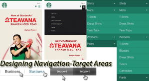
By definition, target areas are nothing, but navigation links designed to easily recognized, easy to click, and consistent throughout the website. Technically target areas have text or symbol label and hot/active area to click, which is linked with other web pages in the website. Sometime tint of graphics is added on the target areas to show it as button like things, but most of the times, it is highlighted through differences in fonts, font sizes, and font or background colors.

In drop-down menu, target areas should have contrast against the similar background and that should reflect in size of target area, texts of labels, and colors of the target areas. On desktops, we have opportunity to change font styles in dim lighting and other ways to respond hover effects. Unfortunately, for mobile users, we have to device other ways.

Size of the Target Areas

In field of human computer interactions, Paul Fitts had quantified the behaviors of the users and predicted some rules to follow. According to him, designers should design target areas a bit larger and closer so users will hit them faster and with comfort or ease. Therefore, experts are advising that designers should utilize every pixel available, and should extend the clickable/tappable areas up to its boundaries.

However, in static websites devised especially for desktop users, can’t follow this rule because they have more than necessary white space and it’s a part of flat and simple design. Of course, responsive web design can stick with maximum utilization of target areas and give the best user experiences in tough gestures. Covering the maximum areas don’t mean to convert or create images in mega-menus, but make them large enough that they can grab immediate attentions of onlookers and facilitate mobile users to tap or select the target areas easily. Thus, enlarging target areas from normal size to 10% can give good usability and UX at the end.

Consistency in Location in Target Areas

Today we have larger websites with multi-level navigation where chances of inconsistent target areas are high particularly in case of nested menu. Therefore, designers use the fly out or slide to the submenus and their location issues are bigger if we don’t keep consistent locations for them. In single-level navigation menus, closing the menu may become the problem if designers don’t provide obvious clues or close buttons at the same areas where it opens.

If you strive for such high level of user experiences and usability in your web development, Lujayn has team accustomed with aforementioned designing techniques and practices to take a chance.

Working with and Building Modal Windows in Web Design Part 1

Summary:

Modal windows are offering extra spaces on the screen without intimidating user experiences if designed smartly. No doubt, making its semantic is the need of moment. Therefore, let’s check the best practices and trends for working with modal windows in your web design project.

Intro:

In web design whether for static or responsive websites, you need to take care of readability, usability, accessibility, and functionality during entire designing and programming process. In due course, organization of information architecture along with design layout is crucial and demanding a bit experiences as well as expertise.

At present, most of the websites are business oriented and highly relying on online identity to accomplish their critical tasks or processes of the business. Therefore, intricacy in design and functionality is natural. Majority of clients and their web developers are screen real estate hungry. They constantly try to include maximum info in minimum space. Thus, their trade-off with layout blocks and responsive design become more complex and force them to find out innovative ideas to justify their content needs.

Technically, we have innumerable GUI elements and structures to organize our ever-increasing content needs. For instance, jQuery-based sliders, Ajax based tabs, and simple pop-ups or modal windows through programming. Among these, modal windows have certain advantages to do off-canvas designing for web and mobile platforms.

Advantages of Modal Windows

Let me list those advantages in brief just to mention:

  • Modal windows are quite smaller UI element in most of the cases so save space
  • It is floating over the existing page so you need not to create special space for them in your layout, just give links or CTA UI element to pop it up
  • It never requires loading of entire page and simulate the Ajax like functionality so end-users like them so you can consider the modal window as improved usability step in your web designing
  • You can move modal window simply by dragging it on the existing page so offer great convenience for users
  • As modal windows are part of off-canvas design, you can add them in multiple occasions and in as many as you need, of course, don’t exceed here too

Contextual Usage of Modal Windows

No doubt, modal windows are excellent structural UI elements, but they are not applicable on all sorts of content or media so be careful while incorporating in your UI designs. Here I am going to listing and depicting where and when modal windows elements should use and not.

For Lightbox

In these days, our images and videos are of large to extra-large size. Therefore, incorporating them on live web page or UI prove costly and strenuous for layout designers. If we use lightbox for images and videos we don’t have to load or reload web page frequently and can reduce the loading burden until lightbox is not opened. You can use thumbnails of images/videos at linking UI element instead of mere text link or simple button. Thus, you can give ideas of the content before clicking it.

Moreover, you have many options to highlight your content of lightbox in modal window design. For instance, you can blur the background of the rest of screen against the lightbox so your visitors/users can easily see the image details or watch video without distractions. Workings with background of modal windows are easy in styling so you can show your creativity freely.

Another usage of lightbox is converting modal windows into the image galleries. Here you can use auto-sliding or manual next-previous buttons to the lightbox to give best user experiences.

There is much other usage of modal windows in web or mobile UI designing, but we will check them in the next part of this series.


Author Bio:

Shoaib Marfatiya is an eminent writer in web development industry and its verticals. He has contributed a lot by throwing lights on very intricate issues of web and mobile development community.


Test Hard, but Test Smart—a New Message to the Designers Part 3

Testing Parameters for Websites

In previous part 2, we have seen that the deep understanding of audiences, devices, and their use-cases can make big difference in decision of testing strategies and methods. Now, in this one more part, we will see that ‘what to test’, and how to formulate browser groups, in order to do smart testing of your mobile websites.


Test Matrix

If we have enough knowledge of testing parameters and we know, which parameters are needed for which products, we can do smart testing with least efforts and greater accuracy. Therefore, it is mandatory to know and decide the testing matrix first.


Screen size: we are aware of fragmentation in the screen sizes of the mobile devices, thus, testing our fluid or responsive layouts, UIs, and various dynamic elements on our major targeted devices in real world make big sense.


Screen Resolutions: Pixel density or screen resolutions is among the parameters to test for the clarity and ease in use of mobile app. However, there are tough time when you have to calculate pixel and sub-pixel values for different browsers of mobile devices during layout preparation of your websites.


Connectivity: user experiences are highly depends on the connectivity issues and speed of connection as loading time increase may distract users of your responsive or mobile website. This the reason that mobile devices are not capable to do high-speed data transfers and use of high-speed cloud or web services at optimal levels as desktops can do. Thus, you need to test connectivity and related issues first and debug them to improve performance.


Interactivity: interactivity depends on many factors in designing and coding. However, styles of interactions like use of pointing devices like mouse and touch gestures through fingers and thumb are important for better user experiences during normal use cases of the mobile website or web app. Some devices have hardware buttons while iOS like have software or operating system elements to do frequent interactions so test them thoroughly in user experience testing.


Similarity among Browsers: it has seen that many browsers have almost similar properties and supports while some have acute differences. Therefore, if we segregate such browsers in groups of similarities and differences, we can save our valuable time from repeated testing, as we can leave rest of similar browsers by selecting only one browsers from the group and focusing on browsers of dissimilar groups more.


Rendering Mode of Browser: As we know modern browsers have two kinds of rendering modes, one is standard client-side rendering and another is proxy rendering. Technically, client-side rendering browsers use resources of client devices, while proxy-rendering browsers use server-side resources to render a page.


Thus, proxy-rendering browsers are quick to respond and fast to load in compare to standard client-side rendering browsers. Therefore, you have to check the kinds of browsers and test them accordingly in their different modes.


If you have pure intentions to make smart testing during your web development or PSD to Joomla development projects, you need to apply all fundamentals described in this series.


Test Hard, but Test Smart—a New Message to the Designers Part 2


Mobile Audience
Mobile Audience

In the first part of this series, I have described my thoughts on testing and my smart strategies for testing responsive web designs.


As we know that the nature and purposes of every website is unique and differing from others even among the same niche and competitors. Therefore, it natural that the audience of the website also unique so we have to consider the traits of website and its audience at first place while deciding the testing strategies.


Properties of Your Audiences

It is true that people from effluent class use mobile devices in more incidences, as that is the latest trend in the market and they always like to keep ahead themselves using costly devices. Against this, young generation wish to see themselves as tech-savvy and modern people so they prefer mobile devices while less affluent class of people have no luxury of desktop/laptop devices along with mobiles. Thus, they choose to stay with low or medium cost mobile devices and use them frequently.


These reveal a hard-fact that we are going to deal with web audiences with desktop devices in minority and mobile users going to be in increasing majority.


Form Factors of Devices

We know that iPhone is more popular in US and Canada as well as some in UK and Australia, while rest of world is fan of cheaper Android devices. Moreover, China and India have their own choices in forms of devices and their smartphones are just like mini tablets or called ‘Phablets’ in industry because they want to type large fonts of their local language characters in their messages.


Against these, cheaper mobile sets from Nokia like companies are popular in rural India where long battery life is a big issue. After looking such variations, we have to decide the choices of devices in the regions of our targeted audiences and test them accordingly.


Time Factor

Use of devices hence the usage of browsers are varying with the time and mood of the people. For instance, it has observed that during working days people are present in their work spaces where they have big sister devices like desktops at hand so their usage found high while on holidays or Sundays it decrease dramatically.


Therefore, we don’t prepare our testing strategies according to the time of engagement of people with devices and browsers, our chances of failure and unexpected errors increasing many folds. Thus, we have to be smart enough to go for testing.


Conclusively, based on these observations and experiences, we web development team at Lujayn are deciding our testing strategies and selection of browser groups


I hope, in next part of this series we will check what to test and how to formulate browser groups to do smart testing.


Author Bio:

Shoaib Marfatiya is an eminent writer in web development industry and its verticals. He has contributed a lot by throwing lights on very intricate issues of web and mobile development community.

Web Development Works A Bit Differently Today

Web Development Project Management

Due to proliferation of mobile devices, internet is ubiquitous and web accessibility is very easy. People use smartphones to do everything including shopping. Therefore, businesses are sincere to have their web presence as well as mobile app in app store.

Unfortunately, latest surveys reveal altogether different things and say that only 50% small businesses in US have web presence. If you think they are busy, not true. They already know the magic of m-commerce and wish to jump into the bandwagon. What is real problem then?

They live in a myth where web development is tough to understand and some failure stories of others intimidate them to go for a website development process. In the past, web developers were discussing about the reference sites with the owners of the small businesses.


In the Past

They were focusing on the pleasing the top management or owners of the businesses, by incorporating color, design, content, etc. of the choice of the business owners. In return, businesses were not thinking about the success and contributing factors in the success. They just were taking proud of having a web presence.


Businesses Take Interests in Web Development Process

Now, scenario has changed. Businesses are discussing the strategies behind the website. They are eager to know their target audience, behavior of target audience, motivation, likeness, and dis-likeness of the targeted audience through initial research carried by the web development experts.

Now, they are ready to cooperate outsourcing companies to know their businesses and their strategies by providing supplementary information to the marketing and technical teams of the offshore web development company that, they have selected.


Businesses Take Active Role in Web Development

In the past, web development process was left on the lower hierarchy post professionals in the small businesses or big businesses. Now, top management is taking personal interests and allocate responsible and capable managers to take active part in the project management software used by the modern web development companies. They would like to interact directly with developers and designers.

Web designers producing wireframes and prototypes of high fidelity using latest designing software on the desktop and smartphones to show their live, dynamic, and interactive wireframes as well as prototypes to their tech-savvy clients instead of mere PSD or JPG or PNG files from the web designers. The live and timely feedback of the businesses making web development a bit differently than they were in the past.


Businesses Aware of Time Frame and Budget

Active interest and live interactions remain up to the completion of the website development or web application development project. Businesses are eager to know the testing results in their regular updates in PMS or through instant messengers. They are upfront asking the time line and budgets of their web development project and keep close eyes on the development process.

Many small businesses are smart enough and taking hire web developers packages as advantages and save a lot of money and time for their project. Therefore, I have put title of page as modern web development works a bit differently and create true collaborations as well as maintain partnership like relationships with web development companies in favor of both sides.


Intro with Lesser-Known but Brilliant Apps for Web Developers Part 2

In previous part 1, we have explored some cool lesser-known tools for CSS and HTML users in particular. Now, in this part, we may have some more robust helping hands for various purposes to ease the life of the web developer community.

CodeKit – Steroid for Web Developers

This application is exclusively build for Mac users and it eases the lives of SASS or LESS lovers along with many numerous scripts such as JavaScript, Stylus, CoffeScript, Typescript, Jade, etc.

It does nothing but compiles the files of SASS or LESS like scripts on the go, optimize them along with your projects images and reload the live page in browser window as readymade product.


XRAY – To See Through

During web development, we need to inspect elements frequently and opening browser’s  tool in a separate window hindrance our speed, if element is small and need quick info in code in particular. Therefore, this little bookmark-let XRAY allows us to interrogate a page to look at the box model info in DOM for a particular selected element. You will get all information regarding to the element’s position in DOM and its basic style such as IDs/Classes. This may quick your workflow and cut your mistakes in web programming.


Code Anywhere – Multiplatform Cloud Editor

It is true that majority of web programmers or mobile programmers use desktop as their primary code editing device. However, in recent mobile and cloud era, we have to perform many emergencies while we are on the go, whether in bus, train, car or waiting for commuting. In such cases, we have either laptop, tablet or a smartphone in hand and we need some flecks in the code of our patrons in urgency.

Code Anywhere is especially build for platform and device agnostic coding using available browser. It lets you edit your files from underlying services such as FTP, Dropbox, GiitHub, etc. using impeccable tools in your browser in a collaborative manner. It supports wide range of web formats such as HTML, PHP, CSS, JavaScript, XML, etc. so the lives of web developers become quite easy with Code Anywhere.


JSFiddle – To Create JS, HTML, CSS, etc.

Many time web programmers are in hurry and wish to see quick results of their code in real-time. Thus, JSFiddle gives them opportunities to get such playground. You have enough alternatives there like JSBin ofr JavaScript optimization, Dabblet for CSS building and SQL Fiddle for prototyping data schema.

There are many tools we miss here, which are known or lesser known like Basecamp for project management, Plagiarism checkers, etc. If you are interested in and need more help, you can contact the web development team of Lujayn any time and from anywhere.


Intro with Lesser-Known but Brilliant Apps for Web Developers Part 1


Brilliant Apps for Web Developers

We as web developer community use some standard and essential web development tools in our day-to-day workflow. For instance, IDE, programming software according to the technological specifications, debuggers, analytic software, etc.

These are well-known and highly used tools among the web developers of all ages. Since, our web development is becoming more intricate, due to increased demands from clients, quality credentials, speed, and numbers of technologies entering in the market every day. In such conditions, we need additional helps from the some advanced and lesser-known tools. Therefore, in this series I am going to mention such tools in brief.

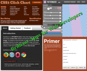
CSS3 Click Chart for CSS Lovers

CSS is essential part of our web programming and keeping CSS code compact is must condition for rapid development. In order to keep CSS code compact, we need to write them in short forms keeping their attributes’ order intake. If you can’t remember the order of CSS attributes, this CSS3 Click Chart is very handy tool to get live code examples of CSS3 syntax according to the attributes you have selected. You can find trendy attributes along with all common ones.

Patternizer for Awesome Code-based Patterns

With augmentation of responsive designing using HTML, CSS, and JavaScript, we can’t rely on the images to create designing patterns on our multiple devices canvases. No doubt, it is daunting task to create code base patterns each time from the scratch. Therefore, Patternizer will surely help you to obtain tiny script in (.js) JavaScript format that may let you create infinitive options in your pattern designs on your website. Patternizer may let you be creative with its GUI and get instant code to place on element.

Sprite Box to Improve Performance

Web developers know one fact obviously that frequent client-server requests cost us in delayed downloading of web pages and interactions. Images are taking big chunk of processing powers and requests in frequencies. Therefore, preparing sprites for UI elements and important images reduce the numbers of images to download and numbers of request to the server in return.

Of course, coding for small and simple project for sprite making is easy, but managing big projects make web programmers sweating. Therefore, Sprite Box has made WYSIWG tools to define/generating sprite classes and IDs based on your uploaded images to create sprites. You can line up your graphics perfectly.

This WYSIWG tool let you to align areas of a sprite image based on the background position properties of CSS using combination of jQuery and HTML5.

Primer for Rapid CSS Creation

We have seen that many web programmers among the web development community who used to write markup first and then create CSS on later stage. Primer is the ideal tool for them. What you have to do is just paste your HTML code in a window and press prime it button. You will have blank CSS code based on the classes and IDS you have used in your markup. Copy them and fill the blanks with your desired styling parameters in those empty CSS nodes. You will have functional CSS files quickly and accurately without syntax mistakes.

There are many other tools out to help you to be productive just like the web development team at Lujayn does. Of course, we will see about them in the next part of this short series.


Some Words of Wisdom on Usability

We might have heard lot of talks on the usability, but in simple words, it is easy to describe and understand usability as a web designer. Therefore, I have given a few lines or phrases regarding to usability and bring them in our web development as well as mobile development project with least hassles, but much efforts!

Phrase #1: Understand the Usability

If you give assurance that your product will work well for the average users with some average abilities and experiences, you are offering absolute usability in the product because you never let your users to fail whatever they intended and without much frustrations. – Make Product Completely Usable.

Phrase #2: Create Self-Explanatory Product

It is obvious that if your users don’t know how to use the product, they definitely leave earlier so make self-explanatory products by guiding them through visual and textual clues and incorporate most possible conventions in UI and UX designing.

Phrase #3: Avoid User Confusions and Frustrations

Users are always in hurry so create UI design and content layouts such a way that your visitors have to think least (simplest products) and can reach at their intended goals rapidly without any frustration in the usage of the products.

Phrase #4: Don’t Trap Users and Offer Free Reigns

It is a fact that back button on the websites is the most used UI element in the history of web and hiding Home button is a sin for good usability. Moreover, search field is a shortcut for repeat users as well as tech-savvy audiences. Therefore, offer all without playing any game with your users’ psych.

Phrase #5: Push Users towards Conversion Rapidly

Try to remove all possible obstacles including some happy talks with your users and push them to reach at their goals hence your websites’ goals-Conversion. Otherwise, they will change their mind and you missed them forever. In order to do this you should keep restrictions over your marketing driven grid to extract maximum info from your users by sign in or registration mess or offering social buttons in the way of checkout unless they push shopping carts in wish lists.

Finally

In short, you never let your users to go without achieving their goals for that they had visited your website or web application. Thus, above usability guidelines will make you an excellent usability and UX designer.