All posts by Lujayninfoways

Expansion of Android Landscape Increasing App Developers’ Pain Part 3

Fragmentation on Testing for Android

Previously in part 1 and par 2, we have analyzed acute fragmentation issues on Android OS and now in this post, we will go to see its effects on testing process and quality maintenance of Android application during and after the app development process.

Testing a Big Challenge

Now, we know that numerous Android OS are running on the litany of Android devices with acute hardware fragmentation. Thus, testing on different hardware competency and screen sizes poses big challenges to the Android app programmers as well as Android app development companies to invest on in terms of time, resources, and money to buy rang of devices with different OS.

Infeasible Manual Testing

At other hand, testing manually on range of devices is not economically feasible at all. Therefore, thinking of automated testing is not a kooky idea at all. If we are going to test everything manually on numerous devices, we can’t touch our deadlines so we need to reduce the number of devices for testing. This again proves hazardous to our quality maintenance promises made to the clienteles.

Testing on Cloud

Unfortunately, not all tests are giving satisfactory results if we run on automated software or simulators and Test Cloud for Android developers is a bit new thing. No doubt, numbers of Android app developers taking interests in Xamarin Test Cloud are increasing day-by-day and they cautiously anticipate targeting the latest features of Lollipop on various cloud testing solutions.

Reliability of Remote Testing Labs

For freelancers and small scale Android app development companies, spending on Android devices for testing are nearly impossible burden to bear at financial point of view and at ROI aspect. Therefore, many smart developers and companies have created testing labs in regional bases as well as offering remote testing facilities for charges.

Unfortunately, it has many limitations and offering better user experiences through such testing method is never preferable. Therefore, fragmentation on Android platform exert acute pain on testing fronts.

Features to Test the Most

With introduction of Lollipop, Android platform has begun new era of Material design so Android developers are more cautious to craft excellent user experiences and testing them frequently. Beacon and Bluetooth related technologies are touching new high and their innovative applications are exciting Android developers to test various parameters using Cloud testing as well as manual testing with real devices. Enterprise Android developers are more focused on new release Android for Work and testing its security as well as management aspects.

Fortunately, Lujayn has expert Android application developers who know how to beat such fragmentation issues on testing fronts and have adequate infrastructure to meet the needs.

Continuous Input (CI) Designing in Mobile A UX Challenge

Continuous Input - CI - Designing
Continuous Input – CI – Designing

In high-tech mobility era, we have more than on input methods for our modern handheld sets. Keyboard, be it virtual form or actual form, becomes the primary methods of input for our tiny computers like smartphones and tablets. Recent invention of voice recognition software has gain good favor, but unable to replace traditional keyboards at all.

Text Inputs Are Trendy

No doubt, numbers of high-end voice recognition software have abilities to translate your words into the texts, but they are useless when privacy and public places are in question. Therefore, our new generation and tech-savvy elders are chat-o-holic and found constantly engaged with their mobile devices whether standstill or on the go.

Continuous Input Methods

Considering the trends, many innovators have created innovative keyboards to help texts chats lovers on the fly. They have developed keyboards capable to do continuous inputs without any interruption occurred by lifting and again pushing the keys because they have implemented swipe gesture where finger constantly moving without losing its contact with touch screen and simply push desired keys with a bit more pressure on the fingertip.

CI Software

No doubt, Android mobile platform is ahead in development and popularization of such continuous input (CI) software for Android devices and OS. Recently, iOS 8 has declared its support for the 3rd party keyboards in somewhat selective and restrictive manners so we have SwiftKey, Fleksy, and Swype like high-end virtual keyboards available for our iPhone and iPad devices.

Characteristics of CI Software

SwiftKey has great autocorrect, autosuggestions, and swipe-to-type functionality. It also uses Facebook, Google, and Evernote account synchronization and storage through SwiftKey Cloud to use your history for accurate and personalized prediction algorithm. Unfortunately, Swype has all features that SwiftKey has, except these sync and Cloud.

However, Fleksy is outstanding keyboard being extremely simple, but working in extraordinary ways. It offers emoji support and intuitive to do highly rapid typing against its all rivals. Whatever, pros and cons of such continuous input devices, they are great to ease and make typing rapid and forcing modern mobile app designers to incorporate them in their designing and prototyping the best user experiences.

Problems of CI Designing in UX and Usability

In due course, many designers have run guerrilla and in-depth surveys to know UX and usability issues of CI designing. During such tests, designers have found few problems that leaving deep impacts on the UX and usability of prevailing CI software paradigm. For instance, if user is not using her memory to recall the key location, she has to look at the keyboard and recognize the key hidden behind the fatty finger. This is the most frustrating experience for majority of newbie and some mid-level experts too.

Possible Solution of CI Designing in UX and Usability

Researchers have found out that recalling memory is the main cause of problem or chain of problems. Therefore, they put emphasis on recognition rather than recall for keys hidden behind the finger. Unfortunately, we have not advance technologies that can simulate the 3D interfaces used in many Sci-Fi movies or TV serials including “Star Treck” where users have ample room to see keys in 3D space and above as well as below the finger.

The practical solution is to create one more keyboard on the screen that simply refers the portion of the actual keyboard in somewhat miniature size keys. If we refer actual keyboard as AK and reference of it as RK, we can place these semitransparent RK on the top lines of the screen to avoid further congestion on the tiny screen of mobile handsets. Of course, addition of virtual spot tracker is essential to know your current finger position.

No doubt, this sort of solution when incorporate with CI software or implement mobile devices, chances are high to consume processing power as well. However, the true usability and user experiences issues may come on the surface when actual solution will developed and tested with real users in practical world. Meanwhile, we have to rely on the smart solutions offered by smart mobile app developers particularly iPhone app developers belong to the reputed mobile application development companies like Lujayn.

Mobile App Checklist for Startups Part 1

In recent high-tech era, all sorts of startups have several challenges as well as opportunities too. If I am going to give some hints regarding opportunities, covering vast global audience is quite easy due to higher penetration of Internet and steadily increases in mobile usage. Internet is representing web-o-sphere while mobile applications have several faces to gain momentum.

This advent of technologies and presence of audience have obsolete traditional marketing and advertising practices. Today we have new words in the air like Internet marketing, SEO, SMO, PPC, in-app purchase, mobile app ads, and mobile applications customized for businesses, and so forth. However, ubiquitous presence of Internet across the devices in form of responsive web designs is solving many problems to address vast audience at a time.

Startups’ Dilemma

Therefore, when startups release or unveiled their business first time, they have a big dilemma that where to invest and how much. As, they have two ultimate options to select one or both and those options are whether creating web presence or going to mobile application development tailored to their needs and budget. However, temptations towards mobile app development are greater than simple or responsive web designing.

Since mobile app development is not rocket science, but also not easy to neglect and left only on the designers or programmers wits. There is a checklist like exercise that need to keep in mind before, while, and after mobile app development. Let’s see what are important points that need to check when we are going to mobile app development process.

Mobile App Design Considerations

For mobile apps, simple layout, graphics, and some images are not the part of the design as they serve mere presentations on the screen. User experiences specific to the mobile devices like smartphones and tablets matter more here. You have challenges in form of various touch gestures used on mobile or handheld devices.

Gestures on Mobiles

Modern devices are offering innovative gestures like speech, air, and body gestures. For instance, in Windows 8 like OS supporting such gestures along with common tough gestures are inducing more intricacies in mobile app design and development in order to address excellent user experiences.

Therefore, your first duty is to gather data of your audience and list which devices they use the most and what are their expectations with your mobile app. Thus, you can check whether you have some sample devices available for testing and other QA purposes during entire development process. Secondly, design layout and other interactions based on the device types and OS used on those devices. Therefore, thorough audience research prior to mobile app development is mandatory step and worth the process to invest in.

Hardware Constraints

Many CEO of small to big companies underestimate mobile app designing process and simply think it is just 2X factor for desktop design, particularly in case of responsive web designing. The third point to consider is resource constraints for mobile devices such as battery life that don’t allow anything to consume excess power or power for longer duration.

CPU processing power is limited in mobile devices so client devices side processing load is not allowed at all, while server side load is good, but connectivity and bandwidth issues need to mitigate further. Finally, memory consumption has many roadblocks despite steady increase in memory allocations in the latest mobile devices.

Content Constraints

Integration of multimedia content seems lucrative for developers as well as owners, but addressing support over highly fragmented mobile landscape put many questions at first place. Therefore, you need to determine rich media content inclusion and heavy interactions or animations according to the devices used by your majority of target audience, as backward compatibility of hardware and OS place many restrictions over your dream of awesome mobile app for all.

Lujayn has team of mobile application developers who have enough knowledge and awareness regarding the above given checklist for the design considerations for your mobile app development project.

Businesses Have Misconceptions about Web Development

It has observed that when businesses decided to have their own web presence and even in responsive web designing, they are running with some common misunderstanding regarding the web development process and web development team. These misconceptions or myths may sour their relationships with web development team or company itself.

Therefore, I have decided to give some insights based on our experiences as a web development team at Lujayn serving wide range of clienteles across the globe.

Myth #1 – These Are Simple Changes

Being a well-experienced web development company, team at Lujayn is preparing project scope documents where we are defining things in advance that what should be included, and what should exclude in the set price structure. Despite such preventions for project creeps, some businesses come up with small changes that they think as minor ones and can address with little efforts and time.

However, that is not true at technical point of view because simple looking websites may have intricate functionality and complex interactions in backend. Thus, always their programming becomes time-consuming and expensive at logic even a simple change in location of a button may take days to accomplish in coding and testing.

Solutions:

Businesses should define their requirements upfront and always discuss with team prior to suggest any changes as well as offer extra cost if your changes require the substantial amount of time and efforts from your hired web development team.

Myth #2 – Templates Are Okay

It is true that market is flooding with ready to use templates or themes and some software available to build a website using GUI tools without doing any coding at all, just drop and drag work flow. Of course, templates are good for those who need low-end and temporary web identity at initial stage and ready to customize them when their time and money come on hand.

Solutions:

In majority of cases, businesses, be they small or big want to augment their brands and have thirst for good ranking in SERP for their business keywords. Therefore, it is imperative for them to come up with unique and SEO friendly websites for their users and bots in order to get the best ROI.

Myth #3 – Web Development One Time Process

Majority of businesses think that once website has built their work is over. However, they are not true because web development is not one time process even though you have created customized web identity with the latest responsive web designing technologies, as web development team needs to update it regularly as well as check or test it frequently for its compatibility and user experiences in contemporary sense.

Web and mobile technologies are ever-changing field and your current websites may become obsolete after two or three years and you need to redesign it with the latest coming technologies at that time.

Solutions:

Therefore, my best advice for business houses to keep good relation with your web development company and take their help regularly by paying on their maintenance packages or for support or update charges.

Myth #4 – Anyone Can Do UX

When businesses have to select the web development company as their IT partners, they used to check presence and capabilities of graphics designers for UI and programmers for interactions and dynamism, but never ask for UX experts. Designing mere UIs and programming them can’t bring good user experiences on your websites because expertise and experiences in UX is quite advance and different discipline in software development as well as in any industrial product development.

Solutions:

Thus, check whether your hired web development team has UX experts included or not and ask for the portfolio of UX professionals too.

Current Common Practices in Web Typography Part 1

Summary:

It is true that web typography is a bit different from print and constantly evolving due to ever-changing nature of web itself. At present, we are experiencing new opportunities on presentation front due to emerging mobile era as well as facing intricacies in implementations. These all force us to reconsider our practices and outlook.

Intro:

Day before yesterday, we were focusing on the print media and little on web media for static desktop like devices. Today responsive web designing practices have changed the entire landscape of web typography. Therefore, today we have to think about the font type, style, font size, and spacing in respect to the ever-changing viewports according to the client mobile and desktop devices. We strive to optimize readability of the web typography across the devices, browsers, and OS. In due course, we need to focus on certain current common practices prevailing in web typography landscape. Let’s check one-by-one.

Type Face

The choice of typeface sets the tone of the entire website and sends right or wrong messages by creating an atmosphere. Our designers are struggling between the Serif and Sans Serif typefaces for an appropriate choice since 2009. If we look back in the web typography of 2009, it was increasing trends for sans-serif typeface in body copy as well as in the headlines. Today designers are creating contrasts in body copy and headings by interchanging of serif and sans serif typefaces in order to improve readability and visual appeal of the website.

If we fine grain the data, we may find that serif typeface has replaced the sans serif in body copy gradually over the last four years. We can see the emerging trends for Georgia and Arial as the most popular typefaces on the responsive websites like The Guardian, Financial Times, BBC, etc.

The Most Common Typefaces

Besides Georgia, there are other popular typefaces such as Chaparral Pro, Freight Sans Pro, Helvetica, Verdana, etc. which have taken place in either body copy or headlines/headings and differentiate from others by creating contrasting effects. However, interesting trends are also visible for the non-standard typeface usage on the recent web development, especially in responsive websites made for multiple devices and screens. This indicates the increasing diversity in web typography.

Diversity in Typeface

As we use CSS in responsive design and fallback typefaces including standard core Web fonts like Times, Times New Roman, Arial, Georgia, Helvetica, etc. are used predominantly as mobile platform fonts. Ironically, comeback of Times, and Times New Roman have widened the diversity of web typography still keeping the old players intact. The real genesis of diversity is leaning trends towards individuality and responsive web on designing landscape.

Many smart web designers are experimenting with typefaces mostly in headings because drastic changes in body copy may prove disastrous particularly in case of responsive designs. However, use of alternative fonts for body copy may create rich panorama and bring more diversity in web typographic landscape.

Fortunately, Lujayn has dedicated web developers who are accustomed with current trends and common practices in web typography landscape and capable to make your project a success legend in this fiercely competitive market.

Designing Simple-Predictable-Comfortable Navigation Part 2

Designing Navigation-Target Areas

Summary:

Target areas, links or clickable/tappable areas are dynamic and live part of the navigation in all sort of web designing, be it for static websites or responsive website designs. There are many factors determine the success of target area designing in course of navigation designing. Let’s check them in brief.

Intro:

In the first part of this series, we have seen that designing navigation is a part of creating information architecture and main menus are vital component of entire navigation system. Therefore, in this series I try to focus on the simple, predictable, and comfortable navigation designing using various components of navigation efficiently. In due course, we have seen navigation symbols in first part and now we will look at the target area designing in this current part 2.

Target Areas in Navigation

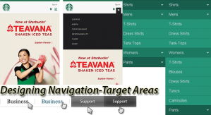
By definition, target areas are nothing, but navigation links designed to easily recognized, easy to click, and consistent throughout the website. Technically target areas have text or symbol label and hot/active area to click, which is linked with other web pages in the website. Sometime tint of graphics is added on the target areas to show it as button like things, but most of the times, it is highlighted through differences in fonts, font sizes, and font or background colors.

In drop-down menu, target areas should have contrast against the similar background and that should reflect in size of target area, texts of labels, and colors of the target areas. On desktops, we have opportunity to change font styles in dim lighting and other ways to respond hover effects. Unfortunately, for mobile users, we have to device other ways.

Size of the Target Areas

In field of human computer interactions, Paul Fitts had quantified the behaviors of the users and predicted some rules to follow. According to him, designers should design target areas a bit larger and closer so users will hit them faster and with comfort or ease. Therefore, experts are advising that designers should utilize every pixel available, and should extend the clickable/tappable areas up to its boundaries.

However, in static websites devised especially for desktop users, can’t follow this rule because they have more than necessary white space and it’s a part of flat and simple design. Of course, responsive web design can stick with maximum utilization of target areas and give the best user experiences in tough gestures. Covering the maximum areas don’t mean to convert or create images in mega-menus, but make them large enough that they can grab immediate attentions of onlookers and facilitate mobile users to tap or select the target areas easily. Thus, enlarging target areas from normal size to 10% can give good usability and UX at the end.

Consistency in Location in Target Areas

Today we have larger websites with multi-level navigation where chances of inconsistent target areas are high particularly in case of nested menu. Therefore, designers use the fly out or slide to the submenus and their location issues are bigger if we don’t keep consistent locations for them. In single-level navigation menus, closing the menu may become the problem if designers don’t provide obvious clues or close buttons at the same areas where it opens.

If you strive for such high level of user experiences and usability in your web development, Lujayn has team accustomed with aforementioned designing techniques and practices to take a chance.

Designing Simple-Predictable-Comfortable Navigation Part 1

Symbols in Navigation

Summary:

At present, many designers are experimenting new techniques in navigation design, but the best user experiences come with simple, predictable, and comfortable navigation only. Let us see how we can accomplish it.

Intro:

Designing navigation means designing information architecture. If you make navigation simple and comprehensive, your chances to win the battle of UX is getting high. In responsive web design era, it is tough to designing navigation that is comfortable and predictable. In general sense, designers are considering some important aspects while designing a navigation menu of any type and we can list those aspects in following ways.

  • Navigation Symbols
  • Target Areas
  • Interaction Events
  • Levels
  • Layout
  • Functional Context

Let’s check them one-by-one in this series.

Navigation Symbols

A day before a yesterday, we were designing navigation system with simple buttons and labeled with texts. Now, in this advanced age of web and mobile navigation designing, we have plenty of new navigation designs to experiment and ways to replace age-old methods. Therefore, today we have some additional elements in the navigation design besides or instead of texts in navigation menus.

In responsive web designing, designers are deprived of screen real estate so inducing much text may prove confronting for better UX. Therefore, most of responsive designers are relying on the small visual clues in form of either icons or symbols in standard conventional ways or in innovative ways with enough guiding or onboarding techniques.

If you are designing web navigation or mobile navigation system, crafting symbolic navigation should be unambiguous and consistent to sustain in the system without missing UX and usability aspects of the design. Let’s check some standard and conventional symbols used in contemporary navigation designing one-by-one.

Using Triangle Symbol

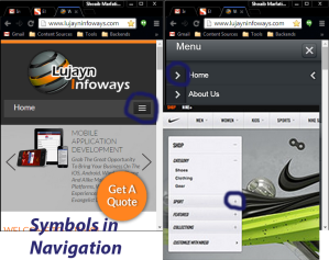
A triangle symbol next to the corresponding menu label/text indicates drop-down or category/sub-category menu depending upon its direction. For instance, downward or inverted triangle indicates drop-down menu while triangle pointing in right/left direction, it indicates fly out menu. Smart designers always consider the available margin in various size of screen and adjust the direction of unfolding action of menu accordingly and responsively.

Using (+) Plus Symbol

Generally, plus symbol indicates unfolding or opening of dynamic navigation and depicts “More” like functionality to expand the dynamic menu further. You can mix two symbols in intelligent ways. For instance, arrow in top navigation menu and + plus symbol for dynamic navigation menu in sides.

Using Three-Lines Symbol

The tree-line symbol is becoming the standard convention in responsive web design and mobile app design because it mostly used to indicate the navigation menu itself and by clicking or tapping on it you can unfold the navigation menu in responsive ways. Sometime designers add “Menu” text or label along with the three-line symbol in order to avoid confusion especially when the same three-line symbol used elsewhere.

Lujayn has smart responsive web designers who know creating conventions through consistency across the web pages or UI screens in the mobile app.

All about Usability and Accessibility of Model Window in Web Design

Summary:

Model window is the most essential element of the web page in modern days, as it provides extra real estate on the screen and serving contextual content ultimately. Despite its usefulness, we never think of its user experiences, usability, and accessibility for instance, through keyboard keys, instead of mouse.

Intro:

For web and mobile designers, popup, nag screen, interstitial, etc. are devil creations and enemies of better user experiences, against the user friendly and useful model windows, created with great care. In fact, model windows offer unprecedented advantages for developers like delivering contextual info, notifications, actions in contexts of current screen, and most importantly some extra space for content or short forms to fill up quickly.

Ignorance of Model Windows

Despite their essential and usefulness, developers often ignore them during designing and programming, particularly at the usability, accessibility, and user experiences point of views in modern responsive web designing. For instance, if any user is favoring navigation of your website through keyboard instead of pointing device like mouse, she will get frustrations when a model windows popup immediately in contexts of some actions or anyway.

Yes, there are frustrations because dealing with model windows always need mouse pointer to take some actions on button or activate the input fields on the model windows. If user wants to ignore it and close it, she again has to use mouse pointer to click the ‘X’ close button on the model windows anywhere.

Of course, there are alternatives to use keyboard shortcuts like tab-key or alter-tab keys, but they are not universal and applicable in all OS or versions of OS. If, user is reaching on the model windows there is no guarantee that Esc key shortcut will work to close the model windows.

Need Attentions

In short, we can say that we need some programming hacks to make model windows accessible and usable in all sorts of use cases of website, be it on desktop or on the handheld devices. Let’s see how we can improve the semantics of the markup of model windows in this post.

Improvements in Semantic

Generally, when we code for model windows, we give it an id in div tags and state a hovering action to close it. Thus, this simple div element of model window has nothing in sense of semantic meaning when any user wishes to use it or closes it through keyboard or screen reader actions.

In order to understand this, if we take one code example of a model window, we can see how improvement in coding is possible.

<div id="modal_overlay">
<div id="modal_close" onClick="modalClose()">
X
</div>

Now in this code, if we correct the semantic of the above code by writing markup for the button instead of simple div element as well as adding an AIRA label for screen reader.

<div id="modal_overlay">
<button type="button" class="btn-close" id="modal_close" aria-label="close">
X
</button>
</div>

This way we address our two targeted issues: keyboard action through tab key and focused state through AIRA label for screen readers. As button can be tabbed and this action falls in convention on the web, our both purposes, usability and accessibility through keyboard have solved.

If you want to take user experiences at the next level, some more efforts through CSS and JavaScript are essential. Let’s check them one-by-one in code examples.

Adding focus states

We grab attention of users through some effects like shadow towards the button so they can know that it is active element and will respond through keyboard actions too. We can do this way:

:focus {
box-shadow: 0 0 3px rgba(0,0,0,.75);

Generally, when model window appears, its background freezes and user begins focusing on the model window. However, this phenomenon never happens automatically and you have to first save the last active element on the screen through coding and in next step, you need to code to shift the focus of user on the model window. Thus, you have to add code for both action through following ways.

Save the Background

You can save background element by adding variable and executing it through function.

var lastFocus;
function modalShow () {
lastFocus = document.activeElement;
}
function modalClose () {
lastFocus.focus(); // place focus on the saved element
}

Shift the Focus

You can do this by giving that element an id and set attributes for keyboard action:

var modal = document.getElementById('your-modal-id-here');
function modalShow () {
modal.setAttribute('tabindex', '0');
modal.focus();
}

Closing Model Window

We can do this simply by using Escape key as it used as standard convention in digital world.

function modalClose ( e ) {
if ( !e.keyCode || e.keyCode === 27 ) {
// code to close modal goes here
}
}
document.addEventListener('keydown', modalClose);

There are more usability steps, but expert and dedicated web developers at Lujayn, always using those advance steps in certain contexts and in favor of its patrons.

Check Performance Metrics across Form Factors In Google Analytics

Enabling Form Factors in Universal GA

Summary:

With the evaluation of responsive web designing, we need to advance our analytics too. We have techniques and tools to know the content breakpoints, but we are devoid of the form-factors based breakpoints. Let’s have a try to include them in our GA.

Intro:

When we design for responsive website, we not design for devices, but for the different form factors means we have to address various form factors by deciding their performance metrics. This is very true in case of UX designing because we want to accelerate and optimize the user experiences for a particular device or set of devices.

Form Factors

Unfortunately, we can’t address each device individually or set of devices one-by-one due to big fragmentation issues on hardware and OS fronts, whether it is iOS and iOS devices or Android OS or Android devices. However, we can address common form factors of the every device and can categorizing them according to their form factors. We can categorize form factors by identifying device experiences in following ways:

  • Through usage or posture
  • Through input methods
  • Through output or screen

These form factors enable us to use Google Analytics and other web and mobile analytics in our responsive designing and give perfect clues to iterate design in ongoing projects or through regular updates.

Form Factors in GA

There are WURFL.js used in the GA to measure its given form factors and we have to include it in to the source code of our responsive websites. Once we introduce WURFL.js into the page code, it creates a global object that you can access through JavaScript in GA and measure various form factors given by it like…

  • App
  • Smartphone
  • Tablet
  • Feature Phone
  • Other Mobiles
  • Desktop
  • Smart TV
  • Robot
  • Other Non-Mobile Devices including wearable

Thus, your Universal GA code would be…

/* Define the custom dimensions */

ga('send', 'pageview', {

'dimension1': WURFL.complete_device_name,

'dimension2': WURFL.form_factor,

'dimension3': WURFL.is_mobile

});

Once you write or re-write GA code in website template you have to go to GA account where you have to define custom dimensions in admin panel

Admin>Custom Definitions>Custom Dimensions

Enabling Form Factors in Universal GA

Now, Google server will collect the data and you need to analyze them through your GA account in your browser so you have to make some customization of your dashboard. Now, click on

Audience>Custom>Custom Variables

For Universal GA, your custom dimensions will available along with the other standard dimensions

By enabling form factor dimensions, we can measure bounce rate and pages per visit to get big picture of their behavior on the various devices. Thus, we can draw fine conclusions in our responsive web designing projects.

Creating Widgets

GA offers a best feature to get alerts when website performance changes for custom dimensions and that in form of Widgets on Dashboard. At first place we will create Pie-Chart widget to analyze how much your responsive website is being used by different form factors.

On Dashboard, click

Add Widget>Pie>Sessions>form factor>Custom Dimension

Here you will group sessions by the form factor variables one-by-one.

Secondly, create widgets for Visits and Bounce rate same the way. Thus, you will have big picture of changes in form factors that are taking place when you make any change in your website design or programming. Of course, you have to add some filters to standard metrics in these widgets and you can do is simply selecting timeline diagram and filter the data flow with your custom variables.

If you create one widget for each of your form factor, you need to watch, you will have good ideas for your responsive website design.

Lujayn has expert responsive web designers who have perfect knowledge of SEO and various SEO tools to use in their advance designing processes.

Some Technical Aspects that Affects Search Engine Crawling

Summary:

The success of SEO is greatly depending on how search engines look and feel your website. Therefore, technologies and technical aspects of the website determine the overall success at the end of the day.

Intro:

It was a time when e-commerce and other websites were made up using Flash like animation technologies. At present, we have innumerable technologies at hand and they are producing simple standstill HTML websites to highly interactive and dynamic web portals using PHP like open source technologies.

Earlier, we were mainly focusing on the audience who accessed front-end side of the websites through browsers, giving cloying graphics and animations using appropriate technologies. Gradually, search engines added one more dimension in the web development and it was SEO friendly website development. Now, businesses are looking for ranking on SERP along with tempting the human visitors on the website.

Website Access at Technical Point of View

Our modern websites have two types of visitors, one is human and another is search engine. Humans have eyes to see and brain to read, feel, sense, and analyze the website content. Whereas crawlers have algorithm to read the source of the website on the server, means bots read backend only.

At front-end, web developers take care of user experiences through myriads of factors in designing as well as in programming. For instance,

  • Cloying UI design with smart UI elements
  • Rapid and dynamic interaction programming
  • Comprehensive information architecture or navigation schemes
  • Content architecture or layout
  • Content on images
  • Multimedia content including images, audio, video, animations, and so on
  • Integration of various 3rd party solutions and extension for advance as well as personalized functionality

These are some considerations for web developers at front-end.

Against these, at back-end we need to take care of all technical aspects that allow all sorts of search engines to crawl the web pages in source code. For instance, various technologies of web design such as

  • HTML
  • CSS
  • JavaScript like various scripts
  • Cookies
  • Robot Tags
  • Programming language
  • IP addresses
  • Hosting
  • Cloud

These all deliberately affects the crawling of the web pages for websites and web application whether they are on traditional servers or on the cloud and displaying in the browsers on desktops or smart handheld devices.

Obstacles for Search Engines

As described above, search engines have to access backend through source code and source code reside on the web server or cloud and it is made up of various components including the front-end elements along with technologies in programming documents.

Search Engine Crawling Issue

Location Factors

Hosting, cloud, and IP addresses are some of the location indicating and permission granting factors. Thus, if you don’t have SEO friendly hosting solutions, how crawlers will access the server and source code easily? If the region of host or cloud is inaccessible for the search engine, you have meager chances of indexing regularly.

Flash, Images, PDF, Animations like Banned Technologies

We know Google like advanced search engines can crawl Flash, Images, PDF at some extent only while rest of other search engines are of primitive type and have banned such content for their visits.

CSS, JavaScript, Cookies like External Factors

We know that CSS and cookies like files are residing at the external locations in the hosting environment and are not included in the main source file like HTML. Similarly, JavaScript is tough to crawl rapidly even for the Google. If your navigation is based on the CSS and your important website info is collected in the cookies, your dream for indexing will abolish soon.

Robot Tags

If you don’t have robot tags or your robot tags are with some serious errors like ‘noindex’ or ‘nofollow’ tags, how poor crawlers dare to proceed further in your web page source code?

In sum, if your design is good, but your source code is not search engine friendly you will lose the ranking battle at long run. Fortunately, Lujayn has expert technical web designing team, familiar with such issues and capable to manage them during the web development process.